25th October, 2024
Swiss Modernism
A focus on clarity, legibility, and functionality in design characterised the Swiss Modernism period, also known as the International Typographic Style. Designers in the 1950s emerged with this movement, marked by the use of grid-based design systems, sans serif typefaces, and a preference for photography over illustrations. Key figures in this movement, such as Ernst Keller, Armin Hofmann, and Josef Müller-Brockmann, emphasised the importance of design adapting to content, with a strong emphasis on typefaces. The movement’s principles rooted in the belief that design should be objective, clear, and easily understood by anyone who views it. The movement’s influence extended beyond Switzerland, significantly impacting corporate communications and graphic design worldwide, with its principles of simplicity, legibility, and the use of grid systems still influencing design today. 1,2.

Josef Müller-Brockmann heavily focused his work around the grid system and Akzidenz-Grotesk typeface. Müller-Brockmann helped popularise the Swiss aesthetic far beyond the borders of Europe by establishing the Neue Grafik (New Graphic Design) journal—a trilingual magazine he co-edited with Franco Vivarelli, Hans Neuberg and Richard Paul Lohse. 1
In the spread above, we can see the slick, geometric, minimalistic design characteristics typical of the Swiss Modernism period. All text is extremely easy to read, the pages are uncluttered, and there are only 3 colours used overall. The rightmost page is simply a photograph with text laid diagonally. The colours are very high contrast to make them even more legible, and the font assists legibility too. It’s very chic and functional.
Postmodernism
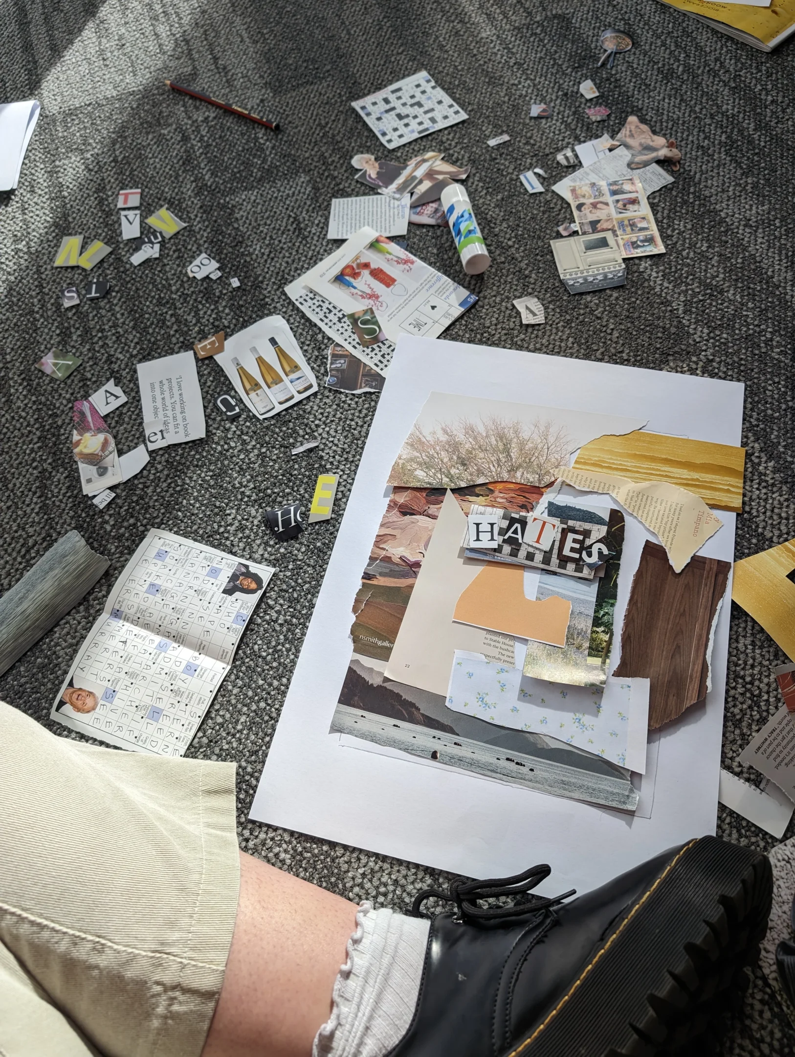
Postmodern design emerged in the late 20th century as a reaction against the formal structures and ideals of modernism, characterised by a rejection of the latter’s emphasis on clarity, simplicity, and functionality. This movement is marked by a complex and eclectic approach, embracing a wide range of styles, materials, and techniques. Postmodern designers often incorporate elements from various historical periods, creating a mix of styles that challenge traditional notions of form and function. Key principles include pluralism, anti-formalism, the use of nontraditional and mixed media, deconstruction, self-reference, and irony. In postmodernism, designers blend the familiar with the unexpected by using collage, juxtaposition, and a playful approach to design. This movement is celebrated for its ability to question and subvert conventional design norms, offering a fresh perspective on aesthetics and functionality in design. 2

Neville Brody was a typographer, graphic designer and art director. Brody is perhaps the best known graphic artist of his generation. He uses letters and numbers in his art pieces with an anti-traditional view of art. He played at the margins of visual language and used it to launch a revolution in typeface design. 2
Brody drew freely to create his visually exciting layouts and typography on avant-garde artistic ideas of the 1920s and 1930s, such as those of De Stijl and Russian Constructivism. Far removed from contemporary editorial conventions Brody’s work had a studied informality in the thoughtfulness devoted to the construction of its layouts, with blocks of texts often placed horizontally or vertically on the page, their often distinctive layouts contrasting strikingly with hand-mediated imagery and photography. Such ideas exerted a significant international impact on the appearance of magazine, advertising, and retailing design.
Above, we can see a distinctly different spread from the first one. There are colours and shapes in places that aren’t necessarily logical or functional. The spread is chaotic, with a range of colours, shapes, line types and fonts. There are multiple textures and overlapping visuals. It’s overall loud and bright.