24th October, 2024
In this blog post, I will reflect on my experience creating my task 2 collage and booklet. During the last few weeks, I’ve put together the project below. This involved choosing a quote from a famous visual designer, and creating a collage inspired by and including the quote. I chose Jessica Walsh’s quote “If no one hates it, then no one really loves it”. I chose this quote because it seemed rather current and divisive.
PDF: Final Booklet
Whilst writing a blog post researching Walsh and her quote, I quickly realised that I do not entirely agree. I wanted to make a collage that visually portrays this tension. Hence, I have created a collage that reads upside down and down-side-up.
I started by taking pencil to paper – the way they did in the olden days. I could not use a pen as I regretfully did not receive my pen licence in 2010. I tried out different layouts with the quote, emphasising different words through sizing and placement. I decided that loves and hates were the most important words within the quote, and conveniently, they have the same number of letters and line up well underneath one another.
INCLUDE PICS

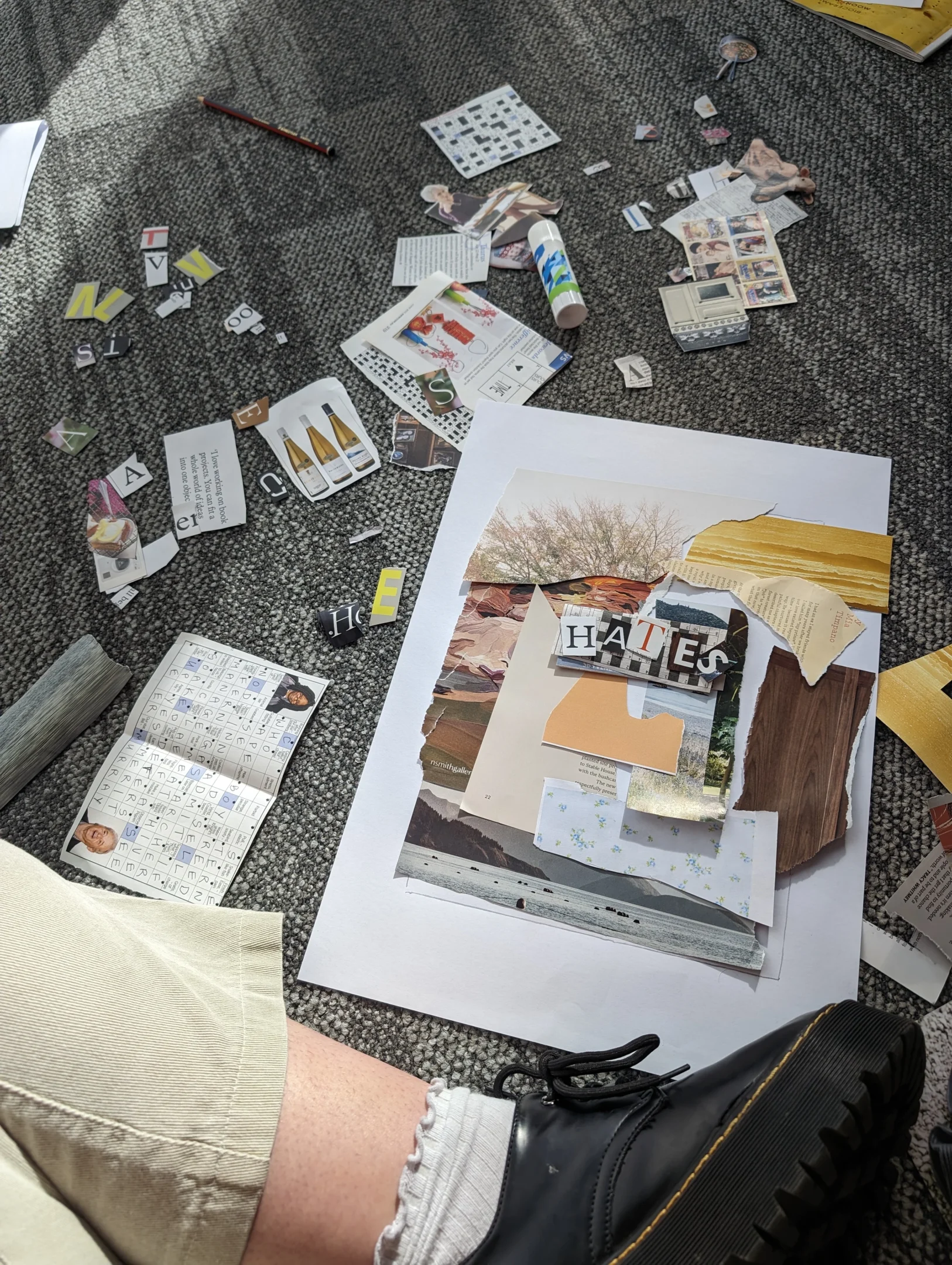


Slider: Making the Collage
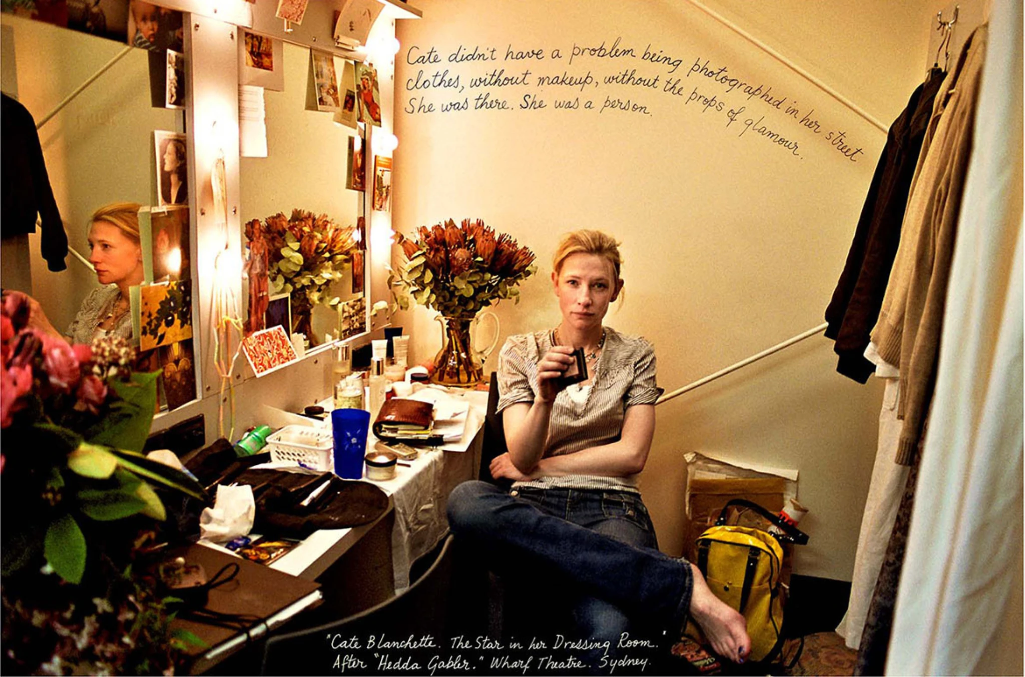
I then began rifling through different magazines and newspapers, looking for the letters that I needed and cutting out anything I found interesting or exciting. Meryl Streep was a must. I wanted to use the crossword somehow, and I decided it made a great centrepiece and backing to my quote.
The biggest challenge I faced during this process was finding the right letters for the ‘big’ words – I needed them to be big enough to stand out, and it was important to me they had a suitable colour scheme and pattern, so that they were legible and pleasing to the eye. I am extremely pleased with the outcome.

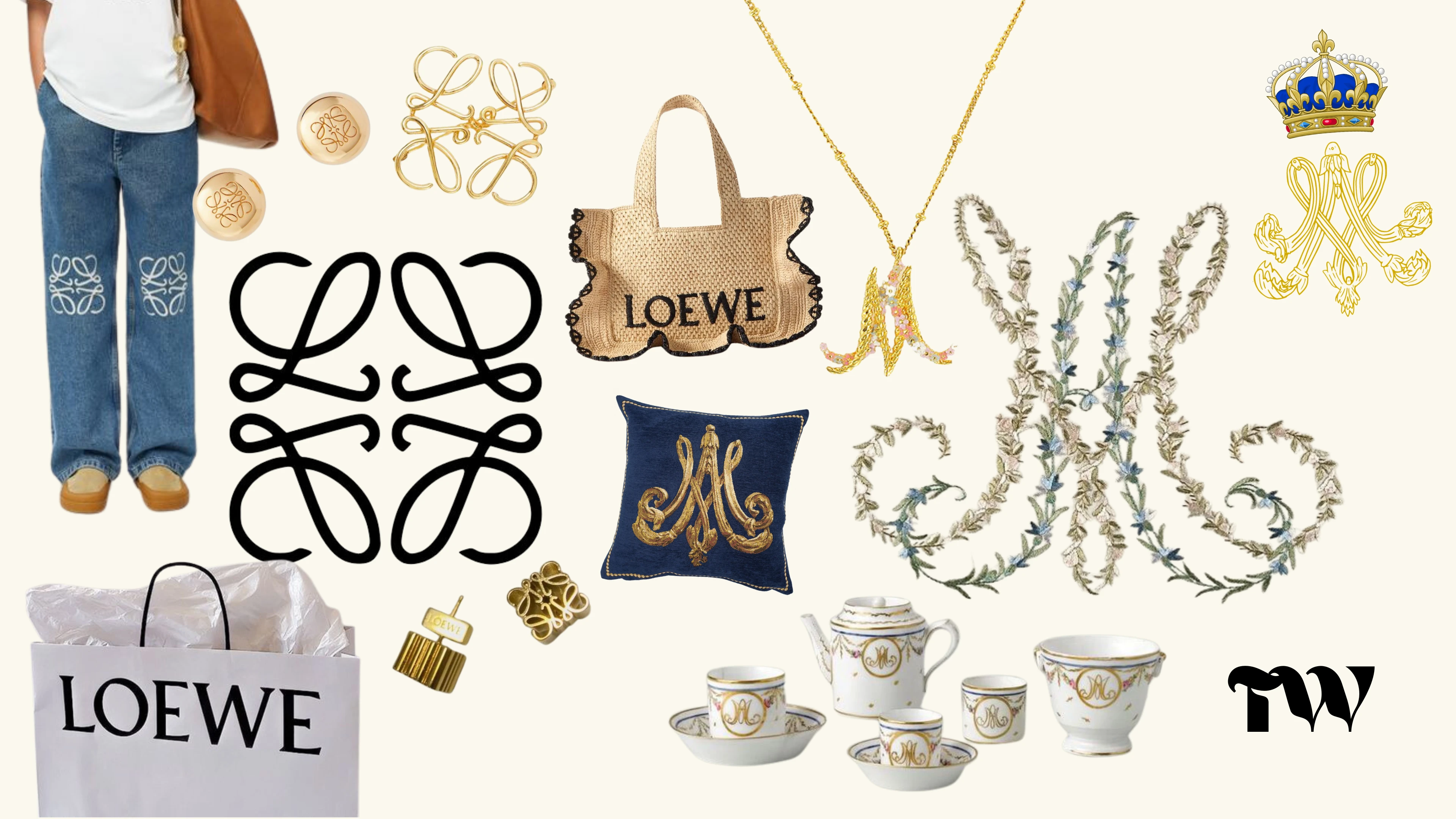
Next, I had to create my monogram. This posed a challenge. I felt upon a google search that my initials – TW – existed on a swinging pendulum between Super Hero Shield and Cliche Wedding Invitation. Neither felt correct.
As always, the only way out was through. I got started putting my initials in different fonts on Canva and arranging them in different ways on my board. I chose a handful of them and exported those as PNG’s and image traced them in Illustrator – so that I could make adjustments to the letter forms where I felt necessary. Eventually, I elected a winner – see below.


Slider: Making my Monogram
So there I was. With my monogram and treasured collage in colour, B&W, single tone and dual tone, I took on InDesign. I tried to arrange my booklet including the provided text excepts. I fiddled until I was happy, and I handed it in on time. Job done. It’s a huge plus that I actually like the work that I have produced as well.
I had never used InDesign before and had very limited experience with Adobe Illustrator and Photoshop. Besides this, I am fairly unfamiliar with the mac interface. This took some working out, some googling and many questions asked to my peers and tutors over the course of the semester.
Going forward, I will have experience using the aforementioned Adobe programs – and the base of knowledge that this project has given me will build my confidence and skill base. This will undoubtedly assist me in future projects, subjects and jobs. I also learned how excited I am by physical media. To have made something that I can hold in my hands is a fantastic feeling. I might even collage during the break. Who knows!
