27th July, 2024
One thing about me, I will absolutely listen to an album with no contextual knowledge of its origins or genre if the cover art is interesting. The only criteria I require to enjoy anything in this world is “looks interesting”. I mightn’t judge a book by its cover, but I’m much more likely to pick it up if it’s pretty. Maybe that’s the photographer in me talking.
Anyway, I was shooting a cover for someone’s music the other day and naturally found myself thinking, “what makes a good album cover, exactly?”
Does it need to have the artist in it? Does it have to be particularly original or visually distinct? Are artists better off commissioning an artwork over a photo? What are some examples that stick out to me as great covers? Does the music make the cover iconic, or does the cover push the music along? Chicken or egg?
So basically, this is a semi-comprehensive list of album covers that stick in my brain and a little discussion of why. Enjoy!
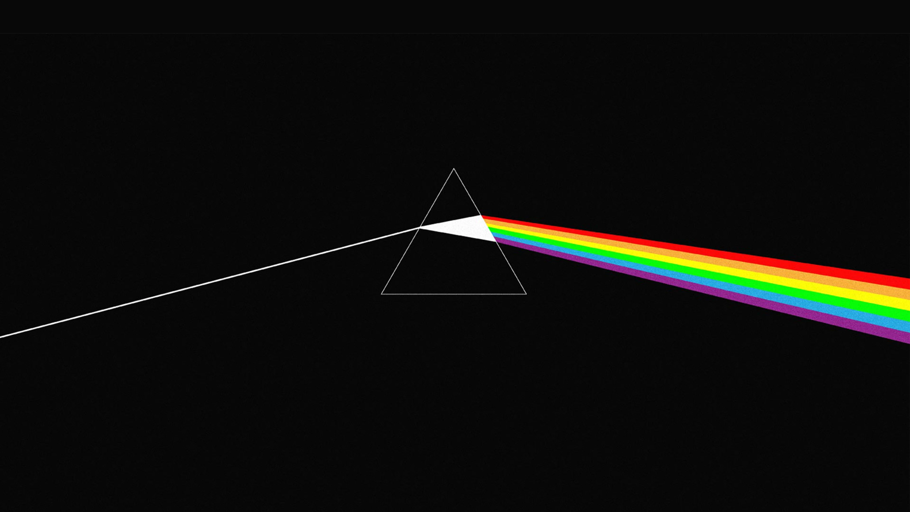
Dark Side of the Moon – Pink Floyd
Obviously, this particular cover is as iconic as they come – you’d be hard-pressed not to see it on somebody’s shirt or hoody at least once a day. It’s hard to say what makes it good outside of its cultural capital, but that’s how you know it’s good marketing.

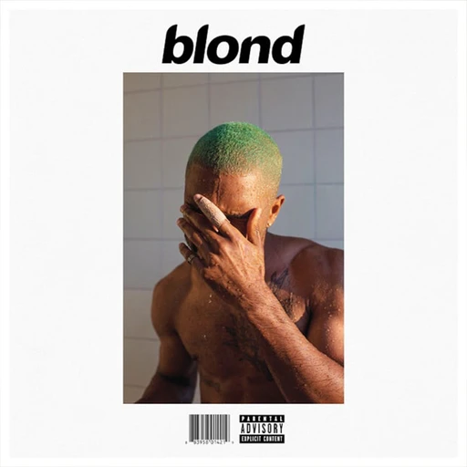
Blonde – Frank Ocean
This is another fairly obvious one – it’s a great photo and a straightforward design, but it asks so many questions. You’d expect Mr Ocean to have blonde hair on the cover. Why is it green? What’s with the bandaid? Is he in the shower? I don’t know, but it’s cool. It definitely asks the question – would this be an iconic cover if the music was not as monumental? We’ll never know.
Starry Night Over the Phone – Allday
I bring this cover up so incredibly often. I’ve been obsessed with it visually for years. I remember seeing it in 2019 and immediately digging through Instagram to find the photographer responsible for such a masterpiece. Her name is Lauren Tepfer, and she’s probably my favourite photographer in existence. So, huge thanks to Allday for that. Also, given the album title, I think it’s an incredible modernisation of what could have been a cheesy concept.

Punisher – Phoebe Bridgers
The contrast between the blue and red, dark and light, the size of Phoebe as compared to her surroundings… it’s beautiful. I think about it all the time. Her skeleton suit has become a little artifact of the pop culture surrounding her music. I love seeing covers where the artist is in the artwork, but they’re not the most prominent thing. It just makes sense.

Sponge Cake – Winston Surfshirt
I remember seeing this for the first time and thinking it just made sense when you listen to Mr Surfshirt’s music. I love collage artwork – here, it’s very 90’s esque. I like the thumb in the bottom corner and how your eyes are drawn to the man’s eyes down the bottom. It’s just a fabulous artwork in the way that it guides your eye.

Born in the USA – Bruce Springsteen
Another classic. This is the image that most people think of when Bruce Springsteen is mentioned. It does feel very patriotic, but not in a way that makes non-Americans cringe and feels nostalgic.

AM – Arctic Monkeys (& that one Joy Division cover)
These are also cool on account of the cultural relevance. They’re basically both just some white squiggles on a black background – but they’re instantly recognisable due to their simplicity.


Swimming – Mac Miller
When I was 17, I met someone who had a line artwork of this cover as a tattoo, and it wasn’t until then that I realised how interesting it is.

Puddinghead – Ball Park Music
This one is cool because it’s weird. That’s Ball Park Music for you, though. I’m sure this artwork has a backstory, but I’d rather stay in the dark about it. It’s so specific that I’ll never recognise it in relation to anything else, and I’d sound like a crazy person trying to explain it to someone who hadn’t seen it.

Masterpiece – Big Thief
I love this album as much as I love the cover. I wonder if the title came first or the cover. I love that trend where people pick photos from their childhood as if they were album covers. This one has that same kind of aura. It looks personal, nostalgic, and a little bit confusing. What’s happening here? I don’t know, and I don’t need to.

Californication – Red Hot Chili Peppers
I don’t think people talk about this cover enough. It’s very typical of the aesthetic of the time it was released, and I think it’s so interesting and, somehow, so simple.

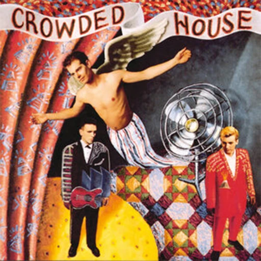
Crowded House – Crowded House
This one feels like a collage, but I’m pretty sure it was a painting. It is what I think of instantly when Crowded House is mentioned – it looks how their music sounds. It’s interesting, and it’s a bit weird. I sometimes think the confusion it induces makes a good album cover.
Harrys House – Harry Styles
I don’t love this album in terms of its music, but visually, it’s impossible not to love it. It’s a very normal, clean thing literally flipped on its head. I want to know how it was shot.

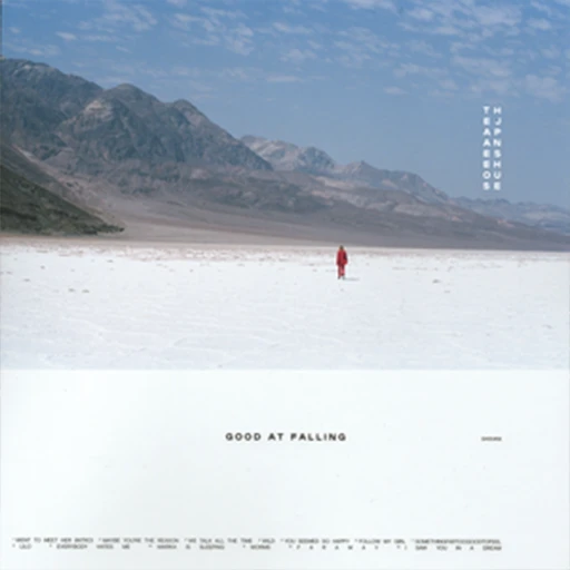
Good at Falling – The Japanese House
This is a cover that I love because of a lot of the same reasons I love the Punisher cover. But also, because this cover looks the way the music on the album sounds/feels. It’s calm, clean, but intriguing.
Hail the Thief & Amnesiac- Radiohead
I love all of Radiohead’s album covers, and the artwork they use is always so unpolished, dystopic and personal. But these are my favourites of the bunch because of their use of colour and lines.


Speaking in Tongues – Talking Heads
I only listened to this album because I liked the cover art. I’m happy to report that the music lives up to the colourful geometric, 70’s feel of the cover.

Young Modern – Silverchair
I can’t put my finger on why, but I think about this cover so often for absolutely no reason. This is the album with “Straight Lines” on it, and it’s one of my favourite songs – I gave my Dad a vinyl of this album for his birthday one year. I see block colours and lines and think of the young modern cover, and it makes perfect sense as the cover for an album named Young Modern.

The Water – San Cisco
I have no worldly idea why, but this cover has stuck with me as an artistic influence for years. I think it’s meant to be a pool – which is interesting because of the RHCP cover I mentioned earlier – they’re so different in tone for something so similar in structure.

The Execution of All Things – Kilo Riley
This cover art makes sense compared to its content. It’s pessimistic, unpolished and a little pretentious. It’s cold, and it reminds me of Kathy Bates in Stephen King’s ‘Misery’ for some reason. It’s another one of those covers where you think, “what does this mean?”.


